What’s wrong with Leica Q3
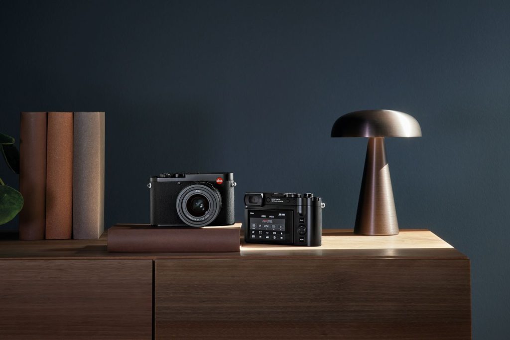
It was a major news day for Leica — the Wetzlar, Germany-based company known for its iconic cameras released Q3, the latest version of the Q, the best-selling fixed lens camera. And new as it might be, Q3 is a big step backward for a product that won a Red Dot award for design when it first came to the market in 2015.
The new Leica Q3 camera features a new 60-megapixel sensor first featured in the Leica M11 camera. The new sensor has some newer capabilities. It has better EVF, wireless charging, and a better back display. It also has better autofocus, thanks to a new blend of phase and contrast detection. It has a lot of video capabilities. But let’s face it, what matters is not inside the camera but in the back.
The rear screen flips — much like a Fuji, Sony, or any other camera on the market now. Leica has taken its sweet time in embracing the flip screens. Nikon and Canon first added flip screens to their cameras in 2008, Sony added flip screens in 2010, and Panasonic (rumored to make Leica’s innards) introduced a flip screen in its cameras in 2011.

Weirdly, introducing the flippy-tilty screen takes away from Leica’s uniqueness. The company has been able to charge more for offering less. The Less is more — and more means more money in Leica’s coffers. Leica’s black-and-white camera costs more than its color version. Nevertheless, the flippy screen on Q3 is a nod to the reality of modern camera design, even if it lags behind the flexibility and adaptability of the screens on Sony, Fuji, and Nikon.
However, how the “flip screen” has been implemented doesn’t sit well with me. I would go as far as to say that the new Q3 camera is a design failure. As a long-time student of Leica camera designs, when I look at the new Q3, I see that it lacks the finesse and the polish of its predecessors and its stablemates.
And I said as much on Twitter. The Q3 design is a step backward from the Q2 model. The company has sacrificed the classic three-button layout of Leica’s design language. It breaks from the design convention of the current lineup of cameras – the Leica SL2, Leica SL2S, Leica M11, and Leica M11 Monochrome.
The new flip screen has eliminated the three-button design — the Play button is above the D-pad. It is just below the thumb grip, so you will likely hear about people “accidentally” hitting the play button. The menu is below the D-Pad, another awkward location for one of the most used features.

“As someone who’s shot the Q system since 2015, I’m partial to the original design…and my hands have a muscle memory that any type of button moving could mess with,” Pete Halverson, a long-time Leica user, said in reply to my tweet. The new screen comes with a slight bump when handling the camera, replacing the smooth flat surface that made Q a design marvel. In comparison, when Fuji introduced a flip screen to its x100 series of cameras, it retained the design and charm and improved on the original camera. No matter how you look at it, the Leica Q3 design team made a classy product feel cheap and inelegant.
And the reason is that it lacks what Swedish designer Vincent Laine, who designed the original Leica Q (and has since left the company), said in an interview with the Leica blog,
For me every detail has the same value, regardless if it is the size of a radius or the choice of leather because in the end it is the sum of all decisions that creates the product. The hardest thing is to stay consistent throughout the complete process in every detail and not lose the core of the concept.
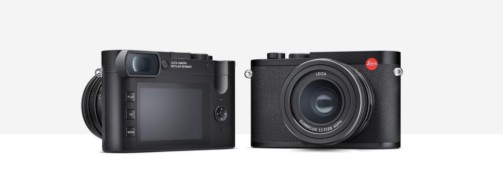
That attention to detail is why Leica Q received many kudos for its design. The next version of the camera, Q2, reduced the five buttons on the left down to three, in the process setting the”three-button design language” that has since become the hallmark of Leica. The three-button layout was in perfect sync with the menu system of the cameras as well. This divergence from that design language is a major usability problem. After all, the reason for standardization was that all Leica owners could easily switch from M to Q to SL.
Of course, you won’t read any of this in the camera reviews, especially on YouTube, including those from self-proclaimed Leica experts. I suppose it helps Leica’s marketing efforts as it means cheap publicity. As I have noted in the past, the camera reviews don’t matter:
As someone who suffers from G.A.S. (gear acquisition syndrome) when it comes to cameras, I spend a lot of time reading camera reviews. And when I am done reading, I watch YouTube videos. And after I am done with each one of them, I realize I am still no closer to making a smart buying decision about a camera because none of the reviews say anything meaningful.
Many of the reviews are just jib-jab: the reviewers are often reciting the laundry list of features, price and how they compare to other cameras. There is very little “review” in these reviews. The camera companies use these reviews as cheap promotion by loaning cameras or lenses to these so called reviewers.
Camera reviews, like all gadget reviews should not be mere reciting of the features but instead photographers have to be honest and candid in sharing their day-to-day experiences with the camera, what it is good for and where it sucks. It is the only way to do their job. Otherwise they are just nothing but shills for camera companies – not worth the hypertext they occupy.
This time is no different — every reviewer has nothing to say about the Q3 and its limitations, especially from the design standpoint. The exception is The Verge reviewer Antonio G. Di Benedetto. And you know why? Because he used to work at Leica and used the Q and Q2 in his past life. He succinctly notes when he points out that”Leica cameras are supposed to all be about the user experience.” Especially on a camera that costs $6000!
I am not a Leica Q guy. I have never liked the Q range of cameras, not because of the design but because I don’t care about the 28mm focal length, and I much prefer the 50mm lenses. My biggest worry now is what this portends for the Leica SL range of cameras. It took me a long time to switch from the four-button layout of the original SL to the three-button SL2-S. If the Q3 design disaster is a sign of things to come, I dread what Leica’s design team has in store for the future version of SL.
May 26, 2023. San Francisco
One thought on this post
Comments are closed.
I share your worries regarding the SL3, Om. I sold the Q1 (got it 2015) and M10 when I got my SL2 in 2019. Since then I’m on the SL track. The SL2 is the best cameras for me so far, the SL1 is my backup or second body if required.
If there will be the same stupid approach with the screen and buttons for the SL3, I probably will continue using my SL and M lenses on a future Lumix S model, once the SLs should stop working or require an update. The button layouts, menus and ugly body prevented me to do this for now.