The Method of the Monster
This is the story of a pen called Monster.
At face value, it is yet another fountain pen, one of the many amongst hundreds of designs created and sold every year. It is also the story of an ambitious young designer, and his desire to create a pen design that can stand the test of time.
I was walking the aisles of the annual San Francisco Pen Show, when I stopped by a table full of fountain pens. They were made of interesting materials — metals, polycarbonates, and a (new to me) hardened industrial plastic called Ultem. Being a materials science nerd — I am a chemistry major, after all — I was captivated by the vast array of materials, finishes, and colors. I kept going over the large tray of pens again and again.
There were pocket pens, and there were big pens. There were pens with vacuum fillers, and, of course, the ones that use the ubiquitous cartridge converters. I picked up two pens from a big tray of pens — they looked about the right size for my hand. One was a clear acrylic vacuum filler, and the other was made of milky polycarbonate. From the minute I picked up the pens and mimicked my writing on paper, I knew they were right for me. They weren’t too expensive, so I said, why not?

The young man behind the table spoke with an Irish lilt. And that’s how I met Ben Walsh, as I would learn, the founder of Dublin-based Gravitas Pens. Our brief conversation, interrupted by the bustling show crowd, would later continue online and evolve into an ongoing dialogue about design, craftsmanship, and the future of writing instruments.
Back home, I compared my new Gravitas acquisitions with the other pens I’d bought that day: a 1950s Montblanc 149 and a Parker 51. Having written with fountain pens since my pre-teen years, I’ve developed a good intuition and feel for pens that work and those that work with you. The latter is the kind of tool that disappears in your hand. It becomes a pure conduit for thought. Montblanc and Parker are definitely in this category. The Gravitas pens showed promise.
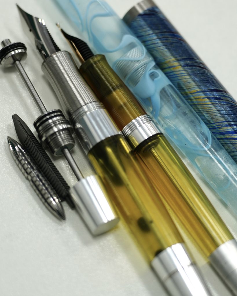
Over the next few months, I bought two more of his pens. My Gravitas collection included a Big Dropper, Sentry, a Vac Filler, and a Kakari Vac-Fill. However, it was the Big Dropper, with its polycarbonate body and distinctive grooved metal grip, that particularly impressed me.
I kept reaching for it without thinking. I felt no fatigue. I didn’t even feel it in my hand. And that, it turns out, is no accident. Its balance was so natural that I wrote with it continuously for a couple of days, only realizing that I was using the pen, when it ran out of ink.
Now, however, was time for me to try something new, Walsh said in a direct message (DM). Instagram DM (direct messaging) is his preferred medium of communication.
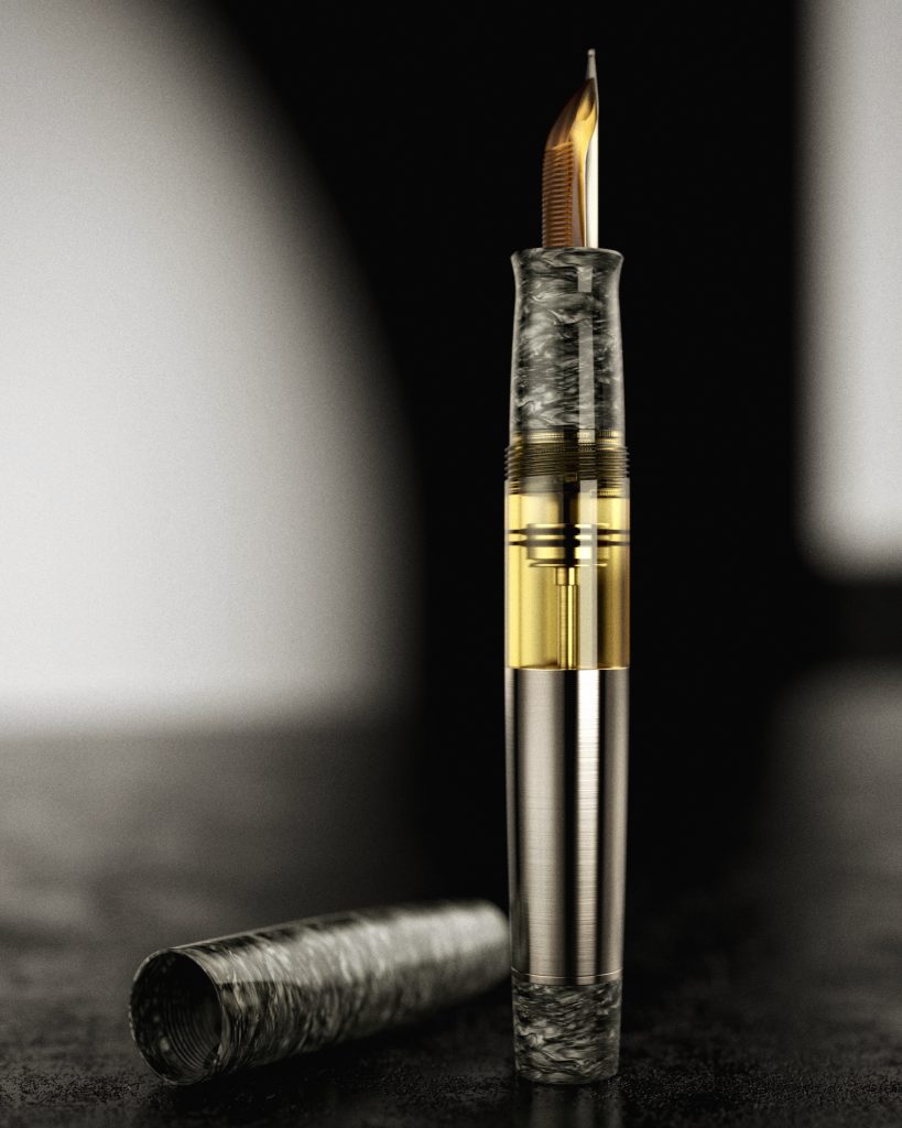
A few weeks ago, I received a package containing a new pen. This was an early prototype that Walsh has named the Monster. When I first met him at the 2023 San Francisco pen event, he had been quietly working on the concept that would eventually become the Monster. I still have no idea why Walsh wanted me to try this pen. I am not a pen expert, nor an influencer. I don’t review pens. But I do appreciate well made things.
“The best design is the one you don’t notice,” Don Norman once wrote. This simple truth has guided my appreciation for well-crafted tools. The best pens, like the best cameras, disappear in use. They become extensions of thought and motion rather than objects demanding attention. As Steve Jobs said, “Design is not just what it looks like and feels like. Design is how it works.”
This philosophy of invisible excellence is what drew me to Walsh’s work. I don’t know how, or why, but I’ve learned to recognize when an object transcends its physical form to become something more essential. Like the clothes we wear or the spaces we create, our choice of tools reveals something fundamental about who we are. When viewed through this lens, Walsh’s work at Gravitas immediately resonated. After decades of writing with fountain pens, I do know what works.
His pens are not without their quirks. For instance, the absence of clips is a constant topic of discontent in online forums. The pens roll off the table, fall on the floor, and snap into two. For Walsh, though, it is a considered decision, not an arbitrary choice. Symmetry is a big part of Gravitas’ design language, and one of the things I am drawn to in his pens.
Every choice, from materials to logo placement, speaks to a deeper understanding of what makes a pen more than just a writing implement. And more importantly, that it speaks Gravitas’ design language.
With clean, uninterrupted lines with a focus on symmetry and balance, Walsh design language is modern minimalism married to precision engineering. It is strong but intentional. It is meticulously machined with no ornamentation, and understated branding.
And that is why there is a clarity to Gravitas as a brand.
Yes, the tiny company is still writing its story, but it has a very strong voice and self-identity. It is one of the reasons why I felt that I should give them a chance, despite the Internet being full of horror stories about poor fulfillment track record, lack of communication and inexplicable delay. Reddit has threads dedicated to Walsh’s poor customer service. The fountain pen world is very unforgiving.
Walsh quickly realized his shortcomings and has found a business partner who is good at what he was terrible at. Pen-Venture, a Rădăuți, Romania-based retailer, now runs the distribution and other logistics, making buying Gravitas less of a guessing game. The complaints about Gravitas have not stopped but have become noticeably infrequent. (Watch the video about the Pen Venture – Gravitas partnership.)
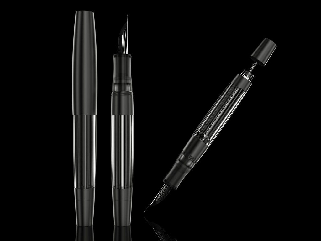
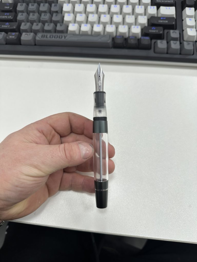
The Monster is an oversized, vacuum-filling, 7 ml-ink-capacity, machined-acrylic creation. This thing is serious. Excessive, yes. But also intentional, almost brutalist in its construction. And has a sensuality at the same time. All of that makes perfect sense, once you talk to Ben.
Ben is not an engineer, at least not formally. “I’m a designer, that’s what my degree is in,” he told me. “I’m also a cabinet maker. After years of working in the furniture and design industry, I’ve picked up a thing or two.”

“It’s not just how the nib performs or how the pen looks aesthetically, but how ergonomically it sits in your hand,” he explained. In other words, he is trying to make sure it feels right. I first spoke with him, because I was curious about why I kept going back to the Big Dropper pen. Why did the balance feel so right? I wanted to know his design process.
So, he showed me renderings of how he calculates balance and center of gravity, assigning density values to each component in CAD to simulate how the pen behaves in the hand.
“Each part has the density assigned individually,” he told me. “That way I can calculate the center of gravity. The lower, the better — but too low, and it becomes heavy at the wrong end. It’s all about balance.”
It might seem like a small thing, but it is everything. A long time ago I saw a presentation by Jared Spool, one of the UX design greats where he said, “When the design is right, you don’t notice the interface, you’re just enjoying the experience.” Walsh’s approach made me think of Spool’s comment.
After trying out many of his pens, I know it is more than aesthetics. I would argue that the engineered minimalism that runs through his entire product line is actually far from the extravagant aesthetics of the traditional fountain pens. It’s all how a pen becomes invisible, and dissolves into the grip, into the hand, into the motion of writing. Walsh builds pens that are expressive, yes, but also grounded. You get the sense that even the weight of a drop of ink has been accounted for.
This is exactly what some of the best-designed pens in history do. The Montblanc 149, introduced in 1952 is a good example. Before it became a luxury status symbol, it was simply a practical tool, built with a piston filler and generous gold nib for those who wrote all day. Or the Lamy 2000, Gerd Müller’s 1966 masterpiece of Bauhaus minimalism. It too is a pen designed to disappear in the hand through seamless joins and perfect balance. With Monster, Walsh wants to create a pen that is generous in capacity, timeless in design and focused on performance. He wants to create a tool that speaks through its performance rather than its novelty.
One of the things that struck me when I first spoke with Walsh wasn’t just that he makes pens — but how he thinks about them. Most makers talk about inspiration. Walsh talks about density. About center of gravity. About the role of mass in comfort, and how to get a pen to feel like it belongs in your hand — not as an aesthetic flourish, but as a physical truth.
When I asked how he decides on the weight of each pen, he lit up. “Oh, you’ll like this,” he said. “I’ll show you the weight decision and how I figure out the balance. Give me 30 minutes and I’ll show you images with the calculated center of balance.”
He wasn’t kidding. A little later, he sent me screenshots of CAD simulations, density charts, and exploded views of the internal balance of his pens. This is a man who prototypes every model himself—not just for aesthetics or nib performance, but to make sure that the tool, in real-world use, works for the writer.
“It’s not just about making pretty pens or complex filling systems,” he told me. “It must go deeper than that with the level I’m working at. Material science is hugely important to this industry, and I take it seriously.”
“I assign the material to the part,” he told me, referring to his CAD workflow. “Each part has the density assigned individually so I can calculate the center of gravity. The lower, the better — but too low, and it becomes unbalanced. It’s about more than just making pretty pens.”
This is not the language of surface design. It’s the language of someone who sees materials as a physics problem. Acrylic is lighter than stainless steel, yes. But that’s not trivia — it’s a fact that shapes everything: how thick the barrel walls need to be, how heavy the section must feel to counterbalance the cap, how the ink chamber moves the pen’s mass as it empties.
Walsh’s approach to design echoes this lineage. “It’s not just about the nib or how it looks,” he said. “It’s how it sits in your hand. How it behaves under pressure. How you forget it’s there.”
Anyway, back to the Monster.
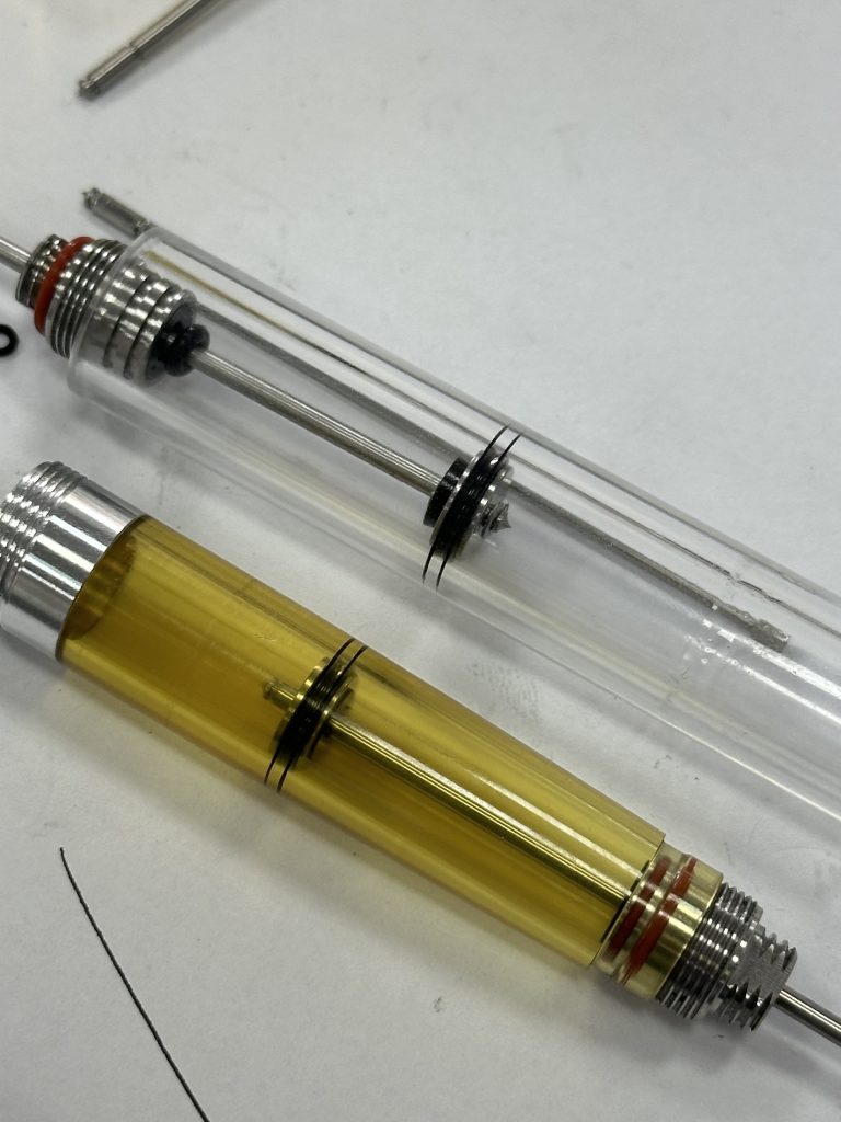
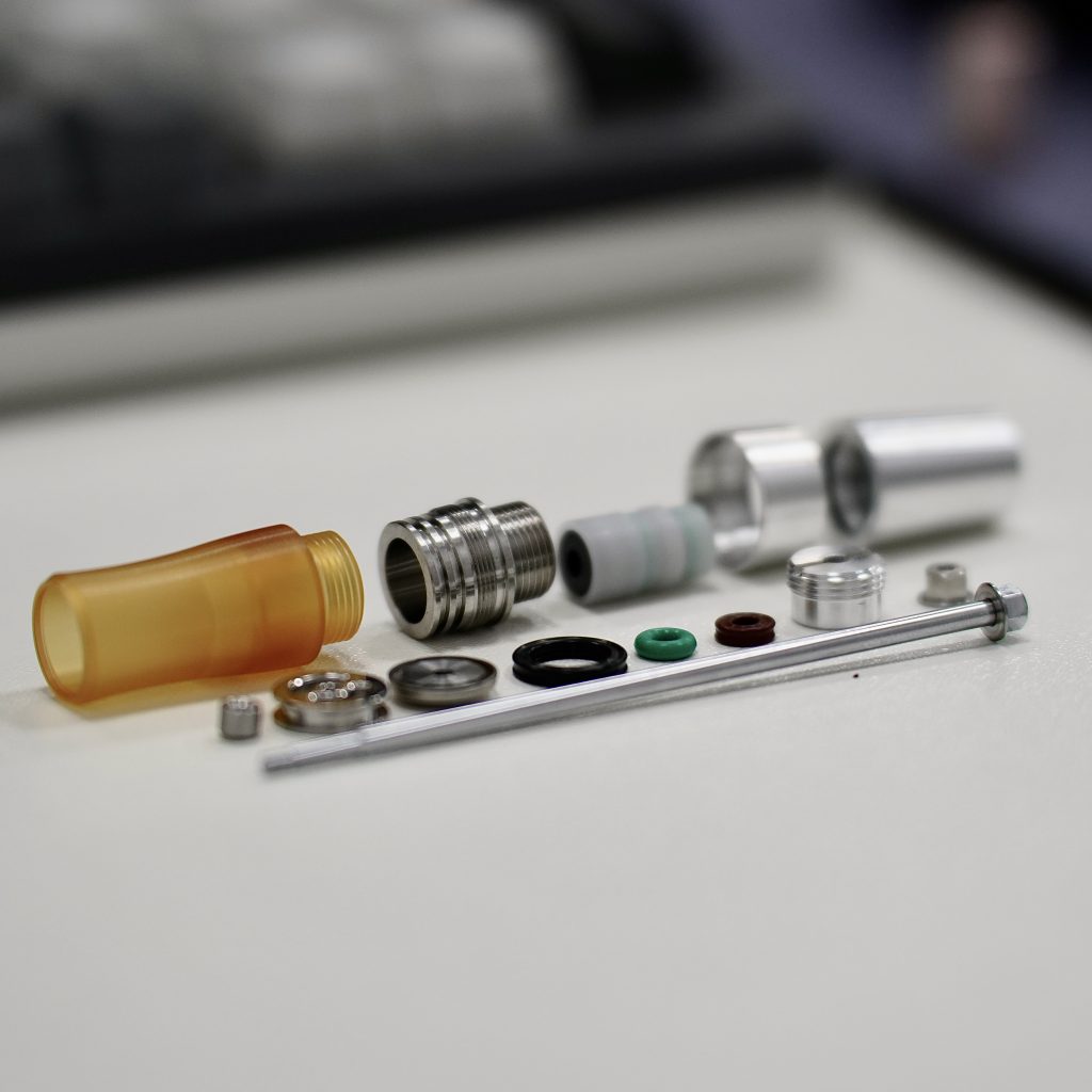
Walsh’s latest creation lives up to its name. It’s one of the largest pens I’ve ever used, yet its excess feels purposeful. Walsh spent two years developing its filling system, starting with pocket pens before scaling up to this ambitious size. The body, crafted from cast acrylic was chosen for its stability. It houses an innovative vacuum-filling mechanism that holds an impressive 7ml of ink.
“It pulls in about twice as much ink compared to my previous vac design,” he said. At one point, Walsh pointed out that the prototype held close to 7.5ml of ink. He backed off, because, “there’s not much need to go past 7ml,” and that with “the weight of the ink sloshing around the size starts to get ridiculous.” That half-a-ml allowed him to increase the wall thickness for durability. Durability, because after all the pen is made of acrylic. If you drop it, it will crack.
“You should always take care with any acrylic pen,” he said. “The material was tested for many months to ensure it was stable. But it’s not impervious to damage. Treat it well, and it’ll last.”
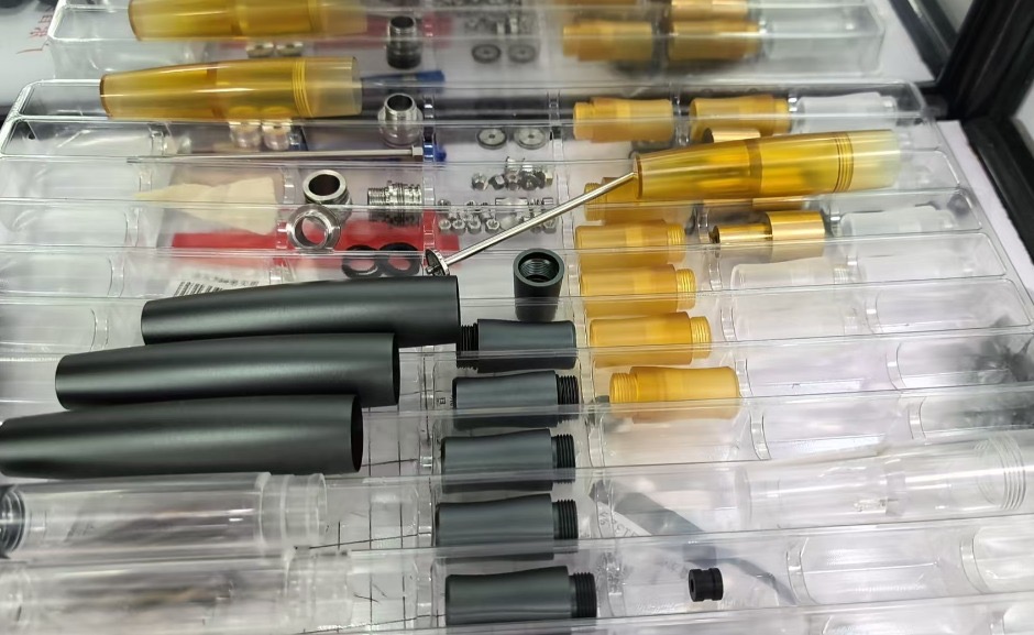
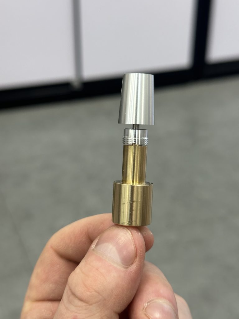
What really is impressive about the Monster is the engineering. It shines in the details. The piston head is machined from stainless steel, with adjustable sizing. He chose practical off-the-shelf quad rings over proprietary gaskets, and precision-machined the ink flow valve. Every component reflects his obsession with balance and function.
After two weeks of daily use, I’m still forming my full opinion. But what strikes me most about the Monster is how it balances its commanding presence with surprising usability. While clearly designed for those who prefer oversized pens, it never feels unwieldy. Walsh estimates that about 25% of the fountain pen buyers prefer large, oversized pens. He is already working on the Mini Monster, a scaled-down version.
Initially, its size gave me pause. As someone who typically prefers more modest pens, I approached it with skepticism, especially when filling it with my precious limited edition Montblanc Tolstoy ink. Yet after an adjustment period, the pen’s careful balance revealed itself. Even its oversized nib, it feels larger than a typical #8, found its rhythm with my writing style.
After two weeks of daily use—five to ten pages of writing each day—the Monster has become my new normal. Other pens now feel diminutive in comparison. Walsh’s latest creation is not just technological achievement. It feels a physical manifestation of a philosophy.
When I asked which pen best captures the essence of Gravitas, Walsh’s answer was immediate: “The Monster.” He described filling the first finished unit after years of development, dozens of adjustments, and countless iterations. “I was shook,” he said. “If I was shook, I hope others might also see and hear it and think, ‘Yep. That’s a Gravitas.'”
You can buy Gravitas Pens from Pen Venture. Visit Ben Walsh on his Instagram.
Published: May 20, 2025.
5 thoughts on this post
Comments are closed.
Om,
I’m a Bic Basic Blue kinda guy.
Clear body, blue top and stopper.
I’ve used them for as long I can remember writing. Started out at 25 cents per….
I’m 70.
That’s a lot of blue.
I so appreciate your appreciation for writing implements. You seem to have such joy in that process.
Good for you!!!
I’m still in search for mine.
Mitchell
Try using a fountain pen. The easiest way to do is buy a Platinum Preppy with a couple of cartridges – cost you about $10 on Amazon. You will be surprised and transformed.
Great write-up, thanks! I will watch for this release with great interest.
Om, informative and interesting. Do you get to enjoy the pens enough ? You mention writing 5 to ten pages each day. Is that usual ?
Thanks. I think five to ten pages is normal for me. I am not sure how others use their pens. Th ask for reading.