Browsegoods, a new shopping experience
Browsegoods, a new shopping site, from Cambridge, MA-based start-up, Dotted Pair, has jumped into the increasingly crowded online shopping space, betting that their shopping experience is going to trump their competitors. They call their service, “visual shopping.”
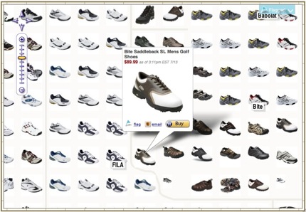 “Most sites make a user scroll through 10 product listings and then hit the ‘next’ button. This is fine if the user knows exactly what he is looking for, but is terrible for browsing,” writes Brian Smith, an online shopping expert, and points out, that Browsegoods “is very similar to the offline shopping experience where the store has organized products into different departments, then different aisles, then different shelves, then finally different sections on those shelves.”
I kinda agree – the UI is pretty interesting and optimized for a broadband shopping experience. They have effectively harnessed the power of AJAX. Their zoom-and-find ability is pretty cool. Take a look. The only dumb thing about the site – it thinks Camino is not cool enough for their service.
Oops – the site is now a tad bit smarter about Camino.
Finally, somebody is trying to make a virtual store that is actually cool..,,
Nice, a little smack down about camino got them working. haha. I like this one – though working on a massively narrowband connection from india is not a good way to experience this site.
Camino needs to surface its ‘pretend I’m another browser’ function to a menu item. Citibank is befuddled by Camino.
another interesting shopping UI is at http://www.crispyshop.com/. This site was also demonstrated at Yahoo the other night at an SD Forum meeting. Great use of flash and the yahoo shopping api.
Doesn’t anyone think it’s interesting to look behind browsegoods.com’s sexy, ajaxy UI and ask what’s doing the grouping of items for sale — associated by color/shape/other similarities of image? How are the visual catalogs built? I don’t think it’s purely textual, and the founder says that this isn’t catalogued by human shoe sorters… Then there must be some interesting multimedia learning going on, no?
Faceted searching (moving through online catalogs by both keyword and categories) is not that new. ATG and Endeca provide both capabilities for eCommerce sites. What’s new here is putting so many small thumbnails on the page at once and allowing a quick way to see one item close up without having to refresh the page. Yes, this is a good use of AJAX.
I like the concept, but found the interface less than intuitive for shopping – specifically the need to zoom in after you’ve clicked on a brandname or product type.
This is really interesting–I work with a company called ATG that powers the online sites for a lot of the biggest brands (Nike, Nieman Marcus, AE, etc.) so online shopping is something that’s always in my head. Visual shopping as a concept is awesome–it taps into the most basic principle, that the online experience has to be comparable (if not better) than brick-and-mortar, and so you’re right on in saying that this is a better browsing experience.
Where my skepticism comes in, though, is how shoppers can cut through the clutter. Savvy retailers are using the concept of searchandising to help market better to consumers, and also help consumers find what they want more efficiently. Better visual browsing is definitely a plus–but at first glance, this looks like a task, to sort out the few shoes I’m interested in from a huge pile. Sort of reminds me of those giant bargain bins, where you have to dig for hours to find the good stuff.
It’s like Google Maps, for shopping.
The general approach is good, but it’s too easy to get lost in a sea of thumbnails. Clicking on an item doesn’t provide enough additional information beyond scrolling and doesn’t enlarge the image at all. If you have to keep clicking away from teh cite to get more/bigger views, that really cuts down on its utility.
Jacob is right. The concept is cool but the zooming in inadequate. The box mouse overs are messy too. I would only show the boxes over the sections that have titles and then automatically zoom so you only see that box’s info in your screen. Right now you have to click 8-10 times to see an actual product…that’s probably worse than the current shopping online experience.
Not to naysay, but I think one has to cater to the lowest common denominator when designing a “general consumer” e-commerce interface. Does the average soccer mom have the proper flash plugin installed in her browser? If I’m mom and I’m prompted to download and install flash to proceed with my shopping, I’m gone. The best part of a well designed commerce interface is convenience and ease of use.
ZoomShelf.com is another site working in this space (faster, more visual online shopping).
Ryan, the site doesn’t use flash or require the flash plugin.
Hi
I guess there is more place to improve and one thing is a 3-D view of each product. Otherwise the UI is innovative and probably future of online shopping.
I found this article just in time for Christmas pretty cool.