New Logos, Old Irrelevance
Paul Kedrosky over on his blog is comparing the logo-shift currently under way. He compares the old-and-new logos of Intel, AT&T and Kodak and sums up the situation, “I’m generally of the view that this sort of thing is a total waste of time and money.”
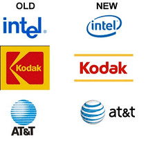 After gazing at the old and new logos, two things scream out. The new logos are not necessarily an improvement over the old ones. Secondly, the logo-makeover cannot distract from the growing irrelevance of these companies. Kodak, the
 phone erstwhile photo giant, despite its fancy new WiFi digital cameras is slowly being usurped by camera phones, and logo-makeover cannot hide that.
Intel’s logo makeover cannot hide the fact that is a chip company. Do you know what’s inside your Plasma TV, your cell phone or your iPod? In the post-PC world, no one gives two hoots about the logo of a chip company, or the chip company itself. Does Broadcom brand itself? Broadcom what? In other words, Intel Leap Ahead, well that’s Intel trying to convince itself of its relevance. AT&T’s new logo? Its a bell company backing to being a bell company? Enough said!
And really….what would constitute an improvement anyway? You could have switched the old and new column and most people wouldn’t really have blinked an eye. I think that companies that are still pouring money into focus grouped logos and “brands” are really missing the point. As Seth Godin said “Starbucks is not Dunkin Donuts with a clever sign.”
Your experience with the product becomes the brand. Regardless of what the marketing department has always thought.
matt, all right i admit, i was trying to be polite here, and not say that it is plain dumb move and waste of dollars. and what’s worse the old ones looked just fine to me.
Totally agree with you. Once they start becoming irrelevant, instead of focusing at the core, they start giving themselves an external fresh makeover. Which I think is a desperate move and won’t help anyway.
Intel and AT&T logos are definately an improvement in design, doesn’t matter if they really needed or not. However, the Kodak logo is a waste.
Kodak, phone giant? excuse me?
I’d love to know how much they spent on these new designs. Can anyone find out? I bet it was in the millions. Only a behemoth can be that obtuse, a sure indication that their carcasses will soon offer some tasty pickings for more nimble predators.
when did kodak become phone gaint?according to me changing logos is a way of adverstising.
arun and anon…. good catch. sorry for not proof reading! oops. too quick to get out of the apartment today!
intel’s old logo is better as is at@t’s as is the old kodak logo. basically all the new ones are worse. estimated cost of asking a designer to make a new identity by an experienced designer $5-7000 . Then if this assignment comes through an advertising agency and is for a big client $12-15,000 dollars+. not including all the formats needing changing (letterheads,billing,products,etc). j
James…”$5-7000″…dream on. It’s in the millions as it’s used on so many things. It has to be analyzed, tested, etc. Then there are corporate identiy guides so everone in and outside the company know how to use it properly in ads, on literature, for sinage and finally on products. I don’t recall exactly what it cost 3M to make the change to the simple “3M” but it was millions and that was over a decade ago.
$3-5K may work for a small startup but rarely for something larger and rarely for a change. $3-5K probably doesn’t even cover the designer’s travel expenses in these cases. 🙂
This re-imaging of brand is just 21st century snake oil. I couldn’t believe it, yesterday, when I saw an advert in a newspaper for an Intel PC supported with the VIIV branding.
Intel’s new identity is an improvement. Their old logo with the dropped ‘e’ always looked corny and slipshod, and the typeface was about as inspiring as Arial in a Microsoft Word document. The new face (whatever it is) has more personality without going completely overboard. I’m not entirely sure the circular bands were necessary, but it’s okay.
Kodak looks terrible. The typeface is too soft, vague. The yellow lines look really out of whack, and feel forced, as if they had to incorporate yellow into the identity somehow, so they slapped a couple of sticks in there.
AT&Ts is…well, a beach ball. Too 3D for me. It will probably look like mud when reduced to small dimensions, unlike their old logo which held up well in any situation.
Then again, I personally think 3D in any logo is a mistake, so I’m biased.
Kodak’s unexciting new logo is one way to go – or they could of just continued investing in ASSvertising. Did you see that gimick?
2D or 3D, at&t still looks like the death star to me. 😀
Kodak’s new logo does’nt relate to the digital space,they have lost the plot in this space.
We worked for Kodak local subsidiary. Kodak old logo is better. Intel new is looking better more dynamic and fresh on one side but the swatches are cliche. AT&T old one is stronger for perception.