iOS 7: Love it? Hate it? Either way, designers are talking about it
My only exposure to the new iOS 7 has been through what was presented on stage and through screenshots. I don’t really have and won’t really have an opinion until I have actually played around with it. However, I have been amazed by the reaction, especially from the design community, the majority of them being critical of the new flat-design that replaces the older, more literal and texture-heavy design of iOS. Intrigued, I asked the question to my Twitter community. Here are some of the responses.
@om without having played with it: visually it lacks affordances and a clear visual hierarchy. Happy to chat.
— Gino Zahnd (@gino) June 11, 2013
Multitasking, tabs, Control Center, AirDrop, and general interactions are looking fantastic in iOS 7. But wow, the ugly stick.
— Jason Santa Maria (@jasonsantamaria) June 10, 2013
You gotta wonder if they took their phones outside and looked at all that thin-lined icon + transparency stuff in the sunlight.
— Josh Brewer (@jbrewer) June 10, 2013
An interesting observation: designers who have actually done any mobile OS design work really seem to dislike iOS7. /cc @om
— Sami Niemelä ⚡️ (@samin) June 11, 2013
@om Icons seem poorly designed and over-complicated. Not enough spacing. Color palate is extreme. Menus like Control Center seem cluttered.
— Matt Galligan (@mg) June 11, 2013
@om on purely visual level it feels unfinished and not that well designed. Helvetica Neue Ultra Light is a weird choice for type, too.
— Sami Niemelä ⚡️ (@samin) June 11, 2013
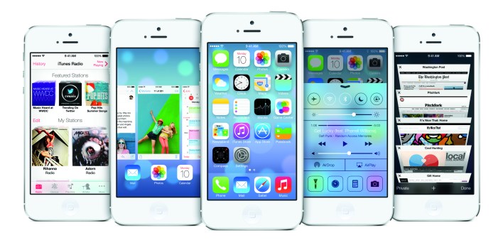
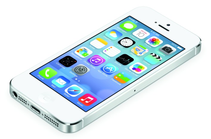
Am I alone in thinking the iOS 7 home screen icons look ugly, poorly balanced, and of an unattractive color palate? pic.twitter.com/MYt1JMIzje
— Matt Galligan (@mg) June 11, 2013
@om I think it’s really just the icons. The apps themselves look decent. I’d rather the icons have no gradient than look like they do.
— Andrew Burwell (@Raddock) June 11, 2013
Apple designers and engineers: you should be proud. Herculean task to redesign and re-imagine your entire OS. Respect.
— Cap Watkins (@cap) June 10, 2013
Tom Coates, co-founder of Product Club, who in a past life worked at BBC and Yahoo’s Brickhouse, wrote back on Twitter in a string of tweets:
At least in part because it looks so much like wireframes with placeholders for things. Bit like a webpage with Times New Roman….It’s cramped in places, childish and garish in others, icons blend in with the background. And some of the design fetishes it has are as egregious if not worse than ios6 — frosted glass, fake depth, sliders with shadows. There are many good things about it too. Don’t get me wrong. App switcher is nice, etc. Interaction wise it looks and feels solid.
But on the other side of the coin are those who actually appreciate the new look.
The good news: the new UX is a big improvement and the UI skin can be iterated and polished over time #iOS7 #WWDC13
— Ben Cline (@yocline) June 11, 2013
@Mike_FTW @om There's work to do; no question (looking at it, a shit ton, for what it's worth). But the general direction is the right one.
— Raphael Schaad (@raphaelschaad) June 11, 2013
@akosner @om Classic issue with most design critique, people over inflate the value of visual design. OS7 is indeed pretty, but other issues
— Scott Jenson (@scottjenson) June 11, 2013
Mike Monteiro (of Mule Design) wrote in a Twitter DM (direct message):
It’s a breath of fresh air. Where was Apple going with the current crap? This opens up all manner of possibilities. I’m excited because it’s new. And fresh. The Forstall crap went to its logical conclusion. Any design system that can no longer be extended is death. The new stuff is a fresh start. Eventually it’ll die too. But right now I’m excited about how it can grow and be extended. It’s not perfect. But, as a designer, that excites me. As a consumer? I dunno.
Craig Mod, who is one my favorite design and content-focused thinkers, wrote:
iOS7 shows us that we’re at a point where design of digital device interfaces simply cannot be accurately assessed from afar. These are living things — systems. Where the physics, the parallax, the subtlety of the movements are all part of the ‘design’ and surface design is just a rather boring tip of an otherwise very deep iceberg. Until we live with the new OS for days, it’s hard to say how successful the new design is or isn’t. What was outlined today looks like a very rational base on which to extend the OS — somewhat timeless, far more timeless than what we had before. The only truly red flags I saw (aside from bad iconography which is trivial to fix) were the decisions around translucency. I’ve never seen an instance where translucency brings clarity, not muddle, to an interface. And from what we’ve seen so far, it looks like it falls on the muddle side in iOS7, too.
Justin Rhoades, a Portland-based designer, said:
I think the design had to be reset so that newer interaction models could surface. More gestures, more animations. They added a physics engine to the SDK. It’s like a pendulum swinging from obvious visual affordances to engaging kinetic ones. The parallax effect, the physics of the messages bubbles and I’m sure many other ‘kinetic’ behaviors are new to devs in iOS7. Apple wants apps to use more motion and less visual design.
There is a furious debate going on over at Quora, where someone asked the question: is iOS7 an improvement? You can either check that out, or take a moment and share your thoughts regarding the new iOS 7 in the comments.
 We’ll be digging into experience design at our annual RoadMap conference in San Francisco in November. Tickets will go on sale later this Summer, and you can sign up here to get first access to them.
Om, would love thoughts on my blog last week anticipating today’s announcements, “Software People Love — is UXD the Next Arms Race?” http://bit.ly/UXDarmsrace
THE BAD:
* Way too much transparency as both gimmick and method for showing “place” within the multi-layer interaction system. Windows 7’s “Aero” interface had a lot of transparency, too, but it only created visual headaches, not clarity. Note that Windows 8 drops almost all transparency in order to create clarity. iOS is headed in the wrong direction here. But no wonder — a hardware designer probably wouldn’t realize this (yet). Hell, I’m having trouble easily reading stuff on the static screen shots. How bad will this be on a real screen in real lighting situations?
* Too-subtle color gradations in icon designs. If you want to go “flatter” just go flat, a la Windows 8 / Windows Phone. To put in just a mild touch of color gradient causes you to stare too much, looking for the gradient. The colors are also weird — they’re not strongly saturated and many are non-primary unnatural colors.
* Typefaces and icon drawing lines are too thin and will wash out too easily on the screen. Yes, it’s “sharp” because it’s thin, but that doesn’t mean it imparts meaning quickly. Consider the Safari icon with all the teeny-tiny compass tickmarks. More tickmarks in the icon does not offer more information or context — it just proves you can make thinner lines because of the Retina display capacity. A smoother thick line would actually show off the Retina display better than super-thin lines, because the super-thin lines will break into pixels easier.
* All told, with the thin lines and thin text and odd colors with barely-there gradients, the icons are not “iconic” enough. I don’t want skeumorphism, and Apple need not copy Windows Phone, but I also don’t want an overly-intellectualized design.
THE GOOD:
* Despite all the “bad” comments above, the old skeumorphism is utterly wiped away and Apple now has a clean slate. Even if they screw up version 1 of the new look, they’ve got time to fix it. No doubt tons of designers will offer “suggestions” that may very well be followed in later revisions.
* Overall shift toward typography as a form of iconography. This is the same thing Windows Phone has done and the “Metro” design of Windows 8 did. Good typography is beautiful and paired with white spaces it can create meaning and function without excessive pictorial iconography. Me likey.
* The in-app designs of interaction, motion, and graphics are remarkably cleaner and more functional than the old apps. Hooray for the design team in these areas.
* As Gruber pointed out, they now have a design framework of layers that clarifies position within the overall system. Agreed, and thank God they cleaned that up.
THE UPSHOT:
I’ll use iOS 7 immediately and I will *mostly* like it — I’ll love it in the apps, hate it on the home screens. Meanwhile I will look longingly at the classic icons over on Android until Apple (hopefully) relents and fixes their home screen icons.
Thanks @john proffitt your feedback is packed with thought provoking comment(s)
Not to take things off topic, but I wonder why nobody thought like this when Windows 8 came out 0_o …… not taking sides here but it was microsoft’s first release of their redesigned interface much like apple, yet people don’t want to give it time to iron out. people nowadays need to be patient with designers and developers as software and interfaces get better (usually) as time goes on and things get ironed out.
One has an established base of users/customers that have already bought into the ecosystem. iOS 1 was complete when shipped. Windows 8 had to be significantly better, not just competing, to get switchers or to overcome that momentum.
Almost anything is better than the old look,that one was so tired. The bright and vivid colors might be a bit too much but i dislike black backgrouds (Android and WP do use black a lot) so there is at least that.
The new OS should look good with plastic casing phones but not so sure it looks decent on ipads and doesn’t really fit current hardware
That rainbow all the time kinda makes you dizzy. Maybe they target 12y olds,maybe they tone it down,we’ll see.
Good point about the iPad — we haven’t yet seen what it looks like there yet. That’s a harder design target because there’s the Mini — with a low-res yet smaller screen, and the large 10″ model with the high-res screen. This new design approach with super-thin lines everywhere will probably “break” on the Mini.
First impression was WTH this it’s not Apple.
Maybe the functionality is near to he same behavior we already know, but it’s a mess of colors and graphics, and I have the same feeling of an Android system that are becoming more usable each new version.
Seems to me that the MS is the “best first looking” GUI, even if I never used it, so the UX is still unknown.
What I understood reading about this graphics revision, was flatting and giving more coherence to the applications simplifying the “skeuomorphism”, not to the launcher of the icons of them.
I like the changes, except for the some of the individual icon designs. I hope they change before release, because that is the kind of thing that Apple tends to move slowly on.
Based on the Jony Ive video they really worked hard on creating a system of design rules around the iconography, but I think they stuck to much to their rules and not enough to the simple observation of whether an icon was actually striking/pretty/functional enough.
What I like is that the OS sets the stage for a clean, crisp design guideline which incorporates a more layered interaction model. The icons and such also have a detail to them that will be revised and improved up to launch, rest assured.
Designing apps requires that the behaviors are interacted with rather than viewed. It is not possible to convey most of what was shown without an app in hand. My team delivers prototypes as documentation for this very reason. Only in development can we even begin to adjust and refine the behaviors.
When you put the new iOS interface up against stock Android the other Android variants, they all look stale now.
First off I love the now look of iOS 7. It’s a refreshing change. I really like the parallax and can’t wait to see it work in person. I also like the new use of white space and the color pallet. Of all the iOS releases in the past I think this is the one that I am most looking forward to installing.
What I find the most amusing it how everyone seemed to have complained that Apple needs to change iOS in a big way before WWDC. Now that Apple has, it’s nothing but nitpicking on something that has not even been released yet.
I guess there will always be those who no matter what a company does, and I’m not just talking about Apple, they will always think they know better. Well I say if you can come up with a better idea then by all means have at it. Last time I checked Apple seems to have no problems selling any of it’s products. Even at a hight price point then their competition.
I think the design hate largely comes from the fact that this look is not at all a Silicon Valley feel. There’s no remnant of video game tech look.
This is very much East Coast: Think “New York Glamour”, classic 1950s Park Avenue, Audrey Hepburn, even Mad Men, etc.
I think designers are ultimately gonna have a lot of fun with this, but it needs a practiced hand to keep it from becoming a cartoon.
The interface just looks like the negative of a photograph. I’m already imagining myself having an eyestrain everytime I use my phone. The “new” features also actually aren’t new at all. Those have been present on other OS’s for a lot of time.
I really hope they make a MAJOR revision of iOS 7 before its release this fall, including its color palette. I think it will also be hard to read from the screen in direct sunlight because of the extremely light colors and thin characters.
To some small degree, I think there’s a tendency of some software designers to be indignant toward or suspicious of Ive — “a hardware guy” — and the audacity to think he can design software.
Plenty to like — and to question and to even dislike — in iOS7, but there’s a small undercurrent of that.
Either way, a shit-ton of work between last fall when Forstall was ousted to this massive makeover. I’m not surprised it’s not all figured out or perfect. But a good start.
Prediction: Those home screen icons get some tweaking. Too many people noticing they just don’t seem to fit the rest of the makeover.
iOS7 looks beautiful.
To me there is a good and bad.
First of the design definitely looks fresh and there is something unique to it. The whole OS just seems to be more alive. There is a
Sense that the OS is modern and also more
Sophisticated than iOS 6. The old one became very static.
-obviously all the bad textures are gone. Specially apps like find my friends or Game Center were just insultingly bad.
-the os seems to give you more space. Header and navigation bars are reduced
-I really like where they are going with the whole dimensional debth concept.
BAD:
-man the icons… They are just horrible in so many ways. The colours are wrong , they are too neon like which gives the whole home screen childish flavor. They are also extremely inconsistent. Some are very detailed like settings and stocks and some
Are just way too plain like calendar.
Also: proportions of the icons are horrible. The music notes on music and iTunes icon look just bad. Same goes with the messages
Speaking bubble . I’d also say
Most of them are too big and that gives them a kind of ‘help I’m trapped’ feeling. Messages, camera , music , App Store , iTunes strore,
Settings , photos and phone icons are a tad too big for their rounded rectangles.
Also the gradients. They are bad . They’re coming from different directions while having the same
Colours like mail and safari and they’re also
Just unbalanced.
Also
Safari icon and mail. They just look bad and like amature work. And Game Center doesn’t even fit in with the 3D bubbles.
I like the addded functionality and features, but boy is it ugly! I mean it’s like Teen-Barbie iPhone or 80′s Miami Vice motif. Maybe they need to add a themes capability to the iPhone to allow for UI and icon set customizations. I would think they could approve themes the same way they approve apps, and people could purchase whichever ones they like. Or even if they don’t want to allow app developers to create themes, then at least create a handful (say 6 or so) of Apple created stock themes with different LAF to allow users to choose something more pleasing.
Why all the trouble of asking around? I am sure it will be good as apple has put lots of time this new design and they still have time for little tweaking
Apple can fix everything with one addition to iOS. Instead of spending hundreds of hours redesigning every icon and interface element… just give us a THEMES option. Obviously, there are more than enough people ready to jump in and create their own icons and themes for the iPhone.
Designers are definitely talking about iOS 7, but what about the D’s in WWDC? From a developer’s perspective, there seem to be some core issues that were ignored (or not yet addressed) in yesterday’s announcements.
As the level of competition continues to increase with Android, iOS has many challenges facing it, with the visual foundation being just one of them. Google’s app development tools have gotten much better, their native apps are starting to outshine Apple’s core apps (chrome vs safari, google now vs. siri, mail, maps, etc..). Wondering if the “green felt” was just a distraction from more important challenges.
For a hint of other key concerns see this twitter discussion: https://twitter.com/aseidman/status/344320998880993280
The new interface seems to be build entirely using the white model of the iphone, i’m wondering how it may look on the black one… All the textures and transparence are bright or white.
It looks half baked, and hopefully it is. My first observation was that the home screen icons don’t have much cohesion as a system.
Color:
The color palette on the icons themselves is juvenile, and not refined, too much variation for my liking. I like what has been done to most of the applications when open where they consist primarily of black, white, and a third color. My issue is that not all the apps follow this pattern to the same degree.
The compass, stocks, and clock apps all appear to leave holes in icon grid when viewed alongside all the other brighter apps.
Typography:
Why does the photo app use a different font than all the other apps.
I know you guys have to pretend that what you see is what you get. But things like icons and fonts can easily be changed once the jailbreak comes out. What was important was that iOS needed to respond to all of the great features that have been on Android for a long time.
You could say they completely ripped them off, but as long as they implemented them I could care less. I am both an iOS and Android user and I find that Android is more of something I’m stuck with because iOS won’t replace some key functions of Android. It almost seems ridiculous that it took Apple this long to add features that were CLEARLY useful. Which was proven by competing platforms time after time.
So the features they added in iOS 7 are all of the things many people wanted. It’s just that people fear change and will always criticize it until it becomes the norm. I used to have to rely on jailbreak for multitasking, quick toggles, better notification center, game controller support, and a better on screen keyboard. Now I don’t have to.
I love the translucency- although it needs to lose some of the sheen but still retain the notion of layers (unlike Skeuomorphism, layering is not a suggestion but actual fact about OS, devices and technology).
Best of all what’s going on behind the surface. The fact that iOS now supports inter-app audio and goes beyond what’s currently possible via Audiobus (and JACK). Fall can’t come fast enough.
I would just say the photos, newsstand icons need to be redone. the others are ok.
Just glad the fake leather is gone. And the Calendar app is now usable in OS X. Would like to have seen what the notepad app on the ipad will look like.
I love the proposed changes to the workings of the iOS but hate the home screen look. The new colors are hideous as are the cheap clipart icons.Maybe I’m old fashioned but I love the skeuomorphism. It would be nice if we had the option to apply that look as a “classic” version, or whatever they’d choose to call it.
….And along comes iOS 7 and what are we discussing primarily? ICONS! Don’t you people realize that?? You’ve been discussing them for years! Are you not tired of discussing what icons look like? Oh wait, I guess you’re not, since you (still) don’t have widgets to discuss.
Of course you are right. There are a lot of new great functions. But icons is what we see when we start up the phone, isn’t it? If you don’t like them (and I don’t) why bother to switch from iOS6 to iOS7?
The new functions are great, I think. But the design is poor. First of all, the resemblance with OS X seems to get lost. Steve Jobs always wanted unity in style, why are the new bosses in Apple leaving this strategy? Second of all, the style combines resemblances to iOS6, Windows Phone and Android. Where is the logic?
The design isn’t just the way the icons look. It’s the functions, the metaphor for those functions, etc. Don’t like the Settings icon? Give somebody a weekend to fix it.
I am using iOS 7 on my phone now and i have to say the OS feels light. All the stock apps seem consistent in terms of design and the the usability is much better. iOS 7 is a welcome change and the direction they are heading is right. There are beautiful animations and attention to details like every other product making it characteristic to Apple. The icons and color palettes aren’t definitely the best yet, but they can only get better.
You’d like to think this has been analysed, tested, reviewed, and discussed to death internally before getting the green light by Apple given its importance. Radical designs never are deemed brilliant on first release and you will never please everyone but time will tell once we’ve used it a fair bit. I wait until then
iOS icons, nothing more than flat skeuomorphism design!? How did this?
Like the latest iPod nano, the icon colors hurt my teeth. They’re like candy and they make the whole thing look like a toy.
To me, not a designer, the translucency looks good, and it keeps the relationship you have with the space. I like it better than that damn linen. Nobody talks about the replacement of the terrible way we now switch from one idle app to another? The ability to place as many icons as you want in the Utilities folder? I’d love a way to easily move icons around. You have to be ambidextrous now. It’s like moving a single billiard ball around a multi-level skating rink now. No telling where the damn thing will end up, or what it will screw up on the way.
As for the rest, it seems that designers, most of them, are great experts on the old design and firm enemies of any innovation that isn’t exactly the way they would do it. The glitchy icons? Does anybody think that Jony Ive will let something suboptimal get out? I think that this is an earlier beta than in past years, because of the rapidity of all the changes. The final three months will be a dead sprint.
I am not too happy with the overly radical design changes. Since its release I have been very happy with every new iOS release. I am a developer (the guy who said “I love you” to Tim during the WWDC keynote was me 🙂 i was also the first fuy in line) and I still can’t identify with the new UI enough to actually enjoy writing apps. I am very nervous for the public release. I hope Apple pulls a Microsoft move and makes iOS 7.1 a major update that AT THE VERY LEAST brings back button borders. Please Apple, don’t ruin what you have